class: center, middle, inverse, title-slide # Module 4 - Session 1 - Data Visualisation ## Working effectively with data ### CivicDataLab ### 2021/10/12 (updated: 2021-10-12) --- <div> <style type="text/css">.xaringan-extra-logo { width: 110px; height: 128px; z-index: 0; background-image: url(https://drive.google.com/uc?id=1WbdosVvi6SBjYtEF6kHj-f0wotdHMRgw); background-size: contain; background-repeat: no-repeat; position: absolute; top:1em;right:1em; } </style> <script>(function () { let tries = 0 function addLogo () { if (typeof slideshow === 'undefined') { tries += 1 if (tries < 10) { setTimeout(addLogo, 100) } } else { document.querySelectorAll('.remark-slide-content') .forEach(function (slide) { const logo = document.createElement('a') logo.classList = 'xaringan-extra-logo' logo.href = 'https://civicdatalab.in' slide.appendChild(logo) }) } } document.addEventListener('DOMContentLoaded', addLogo) })()</script> </div> # The need to visualise data 1. To understand a concept visually -- 2. To demystify what a data point represents -- 3. For making decisions - Spatial data visualisations are good examples of how a map can help in simplyfying complex geographical patterns that further contributes to effective decision making. -- 4. To explore an idea -- 5. To engage with a diverse set of stakeholders -- 6. **It's fun** [SeriesHeat](https://vallandingham.me/seriesheat/#/) by [Jim Vallandingham](https://vallandingham.me/) --- # The Data Viz Quadrant .middle[ .center[  ] ] --- ## Idea Illustration .center[.middle[  ]] --- ## Idea Generation .center[.middle[  ]] --- ## Visual Discovery/Exploration .center[.middle[  ]] --- ## Every data viz .center[.middle[  ]] --- # What restricts us from visualising data 1. Data, that is well documented -- 2. Missing context about the domain or subject matter expertise -- 3. Familiarity with the tools to process and visualise data -- 4. Asking the right questions -- 5. Building convincing narratives tailored for specific stakeholders -- 6. Unequal distribution of data literacy --- # What restricts us from visualising data 1. Data, that is well documented 2. Missing context about the domain or subject matter expertise 3. **Familiarity with the tools to process and visualise data** 4. Asking the right questions 5. Building convincing narratives tailored for specific stakeholders 6. Unequal distribution of data literacy --- class: center, middle # Telling stories using Data **Stories** -- | **Audience** -- | **Medium** --- ## Stories 1. Factoid Stories - _Why does this one data point stand out from the others?_ -- 2. Interaction Stories - _Why do these do aspects of the data change with each other?_ -- 3. Comparison Stories - _What is the meaningful difference between these parts?_ -- 4. Change Stories - _What made this part of the data change from this to that?_ -- 5. Personal Stories - _How does this data connect to the lives of the audience?_ --- ## Audience or Stakeholders Knowledge about the intended user of a data visualisation. What can it change ? 1. **Presentation of information** -- 2. **Content granularity** -- 3. **Visualisation Narratives** -- 4. **Intended Outcomes** --- ## Medium to communicate 1. Static (Media articles, Infographics) vs Interactive (Web Applications, Websites, etc) -- 2. Language to communicate -- 3. Structuring the narratives -- 4. Accessibility -- 5. Stakeholder specific --- ## Activity 1 - Building a Narrative .center[ [Convince Me](https://databasic.io/en/culture/convince-me) - _To practice making data-driven arguments that try to convince different people_ ] 1. Share a data viz with the group -- 2. Questions to ask: 1. Is there an intended audience ? 2. Is there an argument being made ? 3. Are they trying to get the audience to do something ? 4. Who are the stakeholders in the system it describes ? -- 3. Pick people from the group as identified stakeholders -- 4. People from the audience use the data to make an argument to convince the stakeholders -- 5. If the stakeholder gets convinced, they take a step forward -- 6. Ask people about why they made an argument and why they thought it would convince a certain stakeholder -- 7. Ask the stakeholders what convinced them and what didn't --- 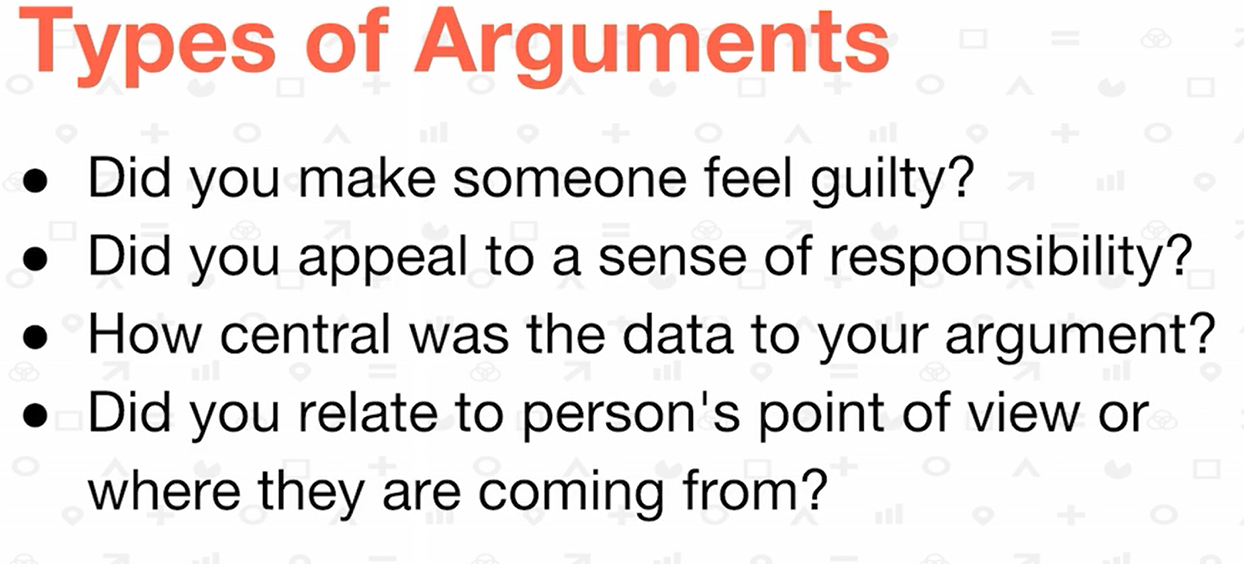 ---  --- ## Data Stories 1. [What's really warming the world ?](https://www.bloomberg.com/graphics/2015-whats-warming-the-world/) _Evaluating arguments_ -- 2. [US Gun Deaths](https://guns.periscopic.com/) - _Gun Control vs Gun Rights_ --- # Building accessible data visualisations .center[ [Vital Coronavirus Information Is Failing the Blind and Visually Impaired](https://www.vice.com/en/article/4ag9wb/vital-coronavirus-information-is-failing-the-blind-and-visually-impaired) ] -- Few things to consider while **designing data viz** solutions: -- 1. Use **alt text** to provide a one-sentence summary of the chart -- 2. Provide **access to raw data** -- 3. If you’re using color, think of how you can convey the same distinctions to people with **colorblindness** -- 4. If you’re using visual media, consider how **blind people can consume your content**. -- 5. If you’re using animation, factor in people with epilepsy, ADHD, or cognitive disabilities, and **give the user control of the animation**. -- 6. If you’re using sound, such as **sonification**(use of non-speech audio to convey information or perceptualize data) or spoken aspects, **think of the deaf**. -- .center[ _Look at accessibility as an opportunity to hone your skills, to move beyond the ordinary, and to provide an intentional experience for your users._ ] --- ## Accessibility Resources 1. [Why Accessibility Is at the Heart of Data Visualization](https://medium.com/nightingale/accessibility-is-at-the-heart-of-data-visualization-64a38d6c505b) 2. [Accessible COVID-19 Pandemic Data](https://covid.ski.org/) 3. [Dataviz Accessibility Resources - Github](https://github.com/dataviza11y/resources) 4. [Accessibility - Fireside Chat - Data Visualization Society](https://www.youtube.com/watch?v=Aqx5PQwds80) --- ## Activity 2 - Reading a data viz .center[ **Deconstructing a data viz** - _Build your visual skills by taking apart an example visualization_ ] -- **Why** - _This activity helps you build the skills (data processing, design, storytelling) by taking apart work that others have done (the good and the bad) to build your critical eye._ -- **How** - _Discuss the visualisation_ -- 1. The data it uses. -- 2. The ways it shows that data. -- 3. The narrative it is trying to tell. -- 4. Evaluating whether it combines those to tell the data story well --- ## Activity 2 - Examples 1. [Line of Succession](https://www.legallyindia.com/images/kianganz/vdyva201_d8d607d945b602eee0be79eb606d9c61.jpg) -- 2. [IJR - 2021 - Vacancies- Pg 33](https://www.tatatrusts.org/Upload/pdf/ijr-2020-overall-report-january-26.pdf) --- # Data to Viz - Selecting charts **Resource** - [From Data to Viz](https://www.data-to-viz.com/) -- **Features** 1. Helps in selecting charts to build as per the type of datasets available -- 2. Basic description of what works where -- 3. Code to implement the charts across multiple platforms -- 4. Lists common mistakes for all chart types -- 5. Linked data stories to check how different charts were used for visualisations. -- 6. Open Source - [Link](https://github.com/holtzy/data_to_viz) --- # Data Viz - Things to avoid 1. [Spotting visualisation lies](https://flowingdata.com/2017/02/09/how-to-spot-visualization-lies/) -- 2. [Examples of quantitative info that is poorly designed for communication](http://www.perceptualedge.com/example19.php) --- # Collaborating with external consultants A **process** to convey the requirements. -- What should be shared: 1. Project Information - What is needed ? -- 2. Call-to-Action - How will the output be used by different stakeholders ? -- 3. Audience - Who are the stakoholders ? -- 4. Use of Data Visualisation - How will the viz be used e.g. on website, printed reports, social media, etc -- 5. How to make the viz more accessible to a diverse set of stakeholders -- 6. Data 1. Source 2. Data Biography 3. Metadata about the variables 4. Assumptions -- 7. Timelines -- [Viz for Social Good - Justice and Peace project](https://www.vizforsocialgood.com/join-a-project/2019/8/1/justice-and-peace) --- class: center, middle # Queries and Feedback